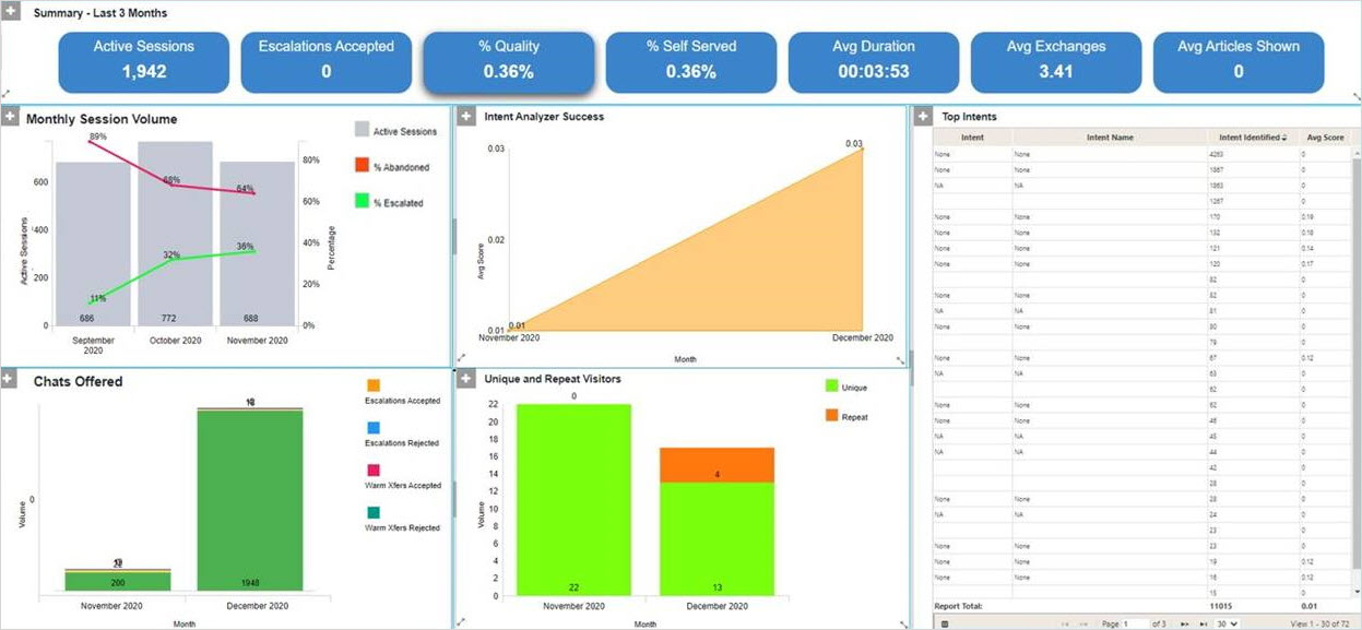
Virtual Assistant Performance Dashboard
The Virtual Assistant Performance dashboard enables you to analyze session volume and the quality of the Assistant’s conversations with customers over the last 3 months.
Reports in the Virtual Assistant Performance dashboard are based on Virtual Assistant Performance and Virtual Assistant Exchanges report models.

The Virtual Assistant Performance dashboard presents the following information:
- Active Sessions: the total number of active sessions that began during the interval. Active sessions are sessions in which the visitor responded to the VA at least once.
- Escalations Accepted: the number of times a visitor accepted the VA's offer to escalate, during active sessions that began in the interval. An escalation is offered when there seems to be a problem with the interaction - typically because the visitor asked for a live agent, rated the VA's solution as unhelpful or showed signs of negative sentiment.
- % Quality: of the active sessions that began during the interval, the proportion in which the visitor did not accept an escalation to a live agent. The visitor may or may not have accepted a warm transfer to a live agent.
- % Self Served: of the active sessions that began during the interval, the proportion in which the visitor selfserved. This means that at least one article was presented, the visitor did not accept an escalation or warm transfer to a live agent, and the visitor was not eligible for an off hours escalation.
- Avg Duration: for each active session that began during the interval, the average time that elapsed from when the VA launched to when the customer sent their final message.
- Avg Exchanges: for each active session that began in the interval, the average number of exchanges that occurred between the VA and a visitor. An exchange is typically when the visitor interacts with the VA (either by sending a message or by selecting an answer to the VA's question) and the VA responds. The VA's initial greeting is also counted as an exchange.
- Avg Articles Shown: for each active session that began in the interval, the average number of times that the VA presented a visitor with a knowledge base article.
The following charts and reports are included in this dashboard:
|
Chart/Report |
Parameter |
Chart Type |
Description |
|---|---|---|---|
|
Monthly Session Volume |
Assistant |
Combo |
A combo chart showing the number of active sessions per month on the bar axis. The line axis shows:
Use this to measure the correlation between VA sessions and escalations to the contact center |
|
Intent Analyzer |
Assistant |
Area |
This shows the average confidence score for the intents identified in each month to determine if the VA is becoming more effectiveness at recognizing intents. |
|
Chats Offered |
Assistant |
Stacked Bar |
This shows the volume of escalations and warm transfers that were offered to customers in each month, broken down into those that were accepted those that were rejected. |
|
Unique & Repeat |
Assistant |
Stacked Bar |
A bar chart that shows the volume of unique and repeat visitors per month, so you can identify the propensity of visitors to return to the VA within a short time span. |
|
Top Intents |
Intent |
Grid |
An ordered list of the intents that were identified most often. Use this to understand what your customers are asking about. Can be re-ordered by average score to identify the intents which are identified with low confidence, which may suggest that the VA needs further training. |